CONVENTUAL
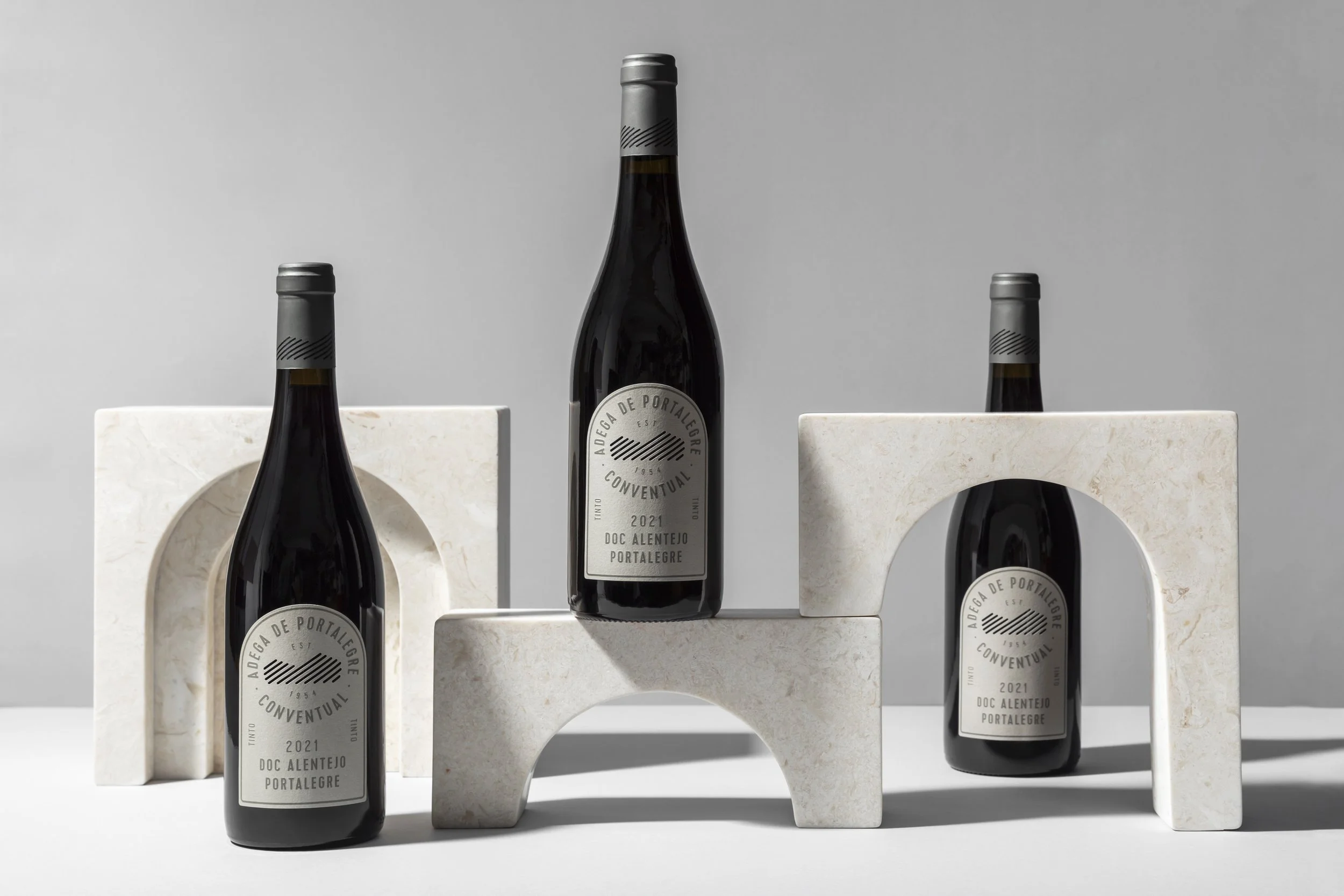
In the re-branding of Conventual by Adega de Portalegre, the brand's identity arch underwent a marked and significant change, moving from an illustrative note to become the shape of the label itself.
This decision reflects the intention to emphasise the symbolism associated with conventual architectural heritage. The graphic stylisation of the arch creates a visual paradox that evokes both mystery and revelation. The typographic composition, meanwhile, expresses complexity and character, elevating the brand's identity.
The label is now a visually captivating element that stands out on shelf, like a portal offering an intriguing glimpse inside the product. A new approach that invites the consumer to embark on a journey of discovery and strengthens their emotional connection with the brand.


